This argument has no end state, which is exactly what makes it so comfortable to keep having. Weeks go into which chart, which shade, which corner. The calendar fills with design reviews. And the one question that decides whether the screen is any good, what the person in charge actually needs to see to make the call, somehow never makes it onto the agenda.
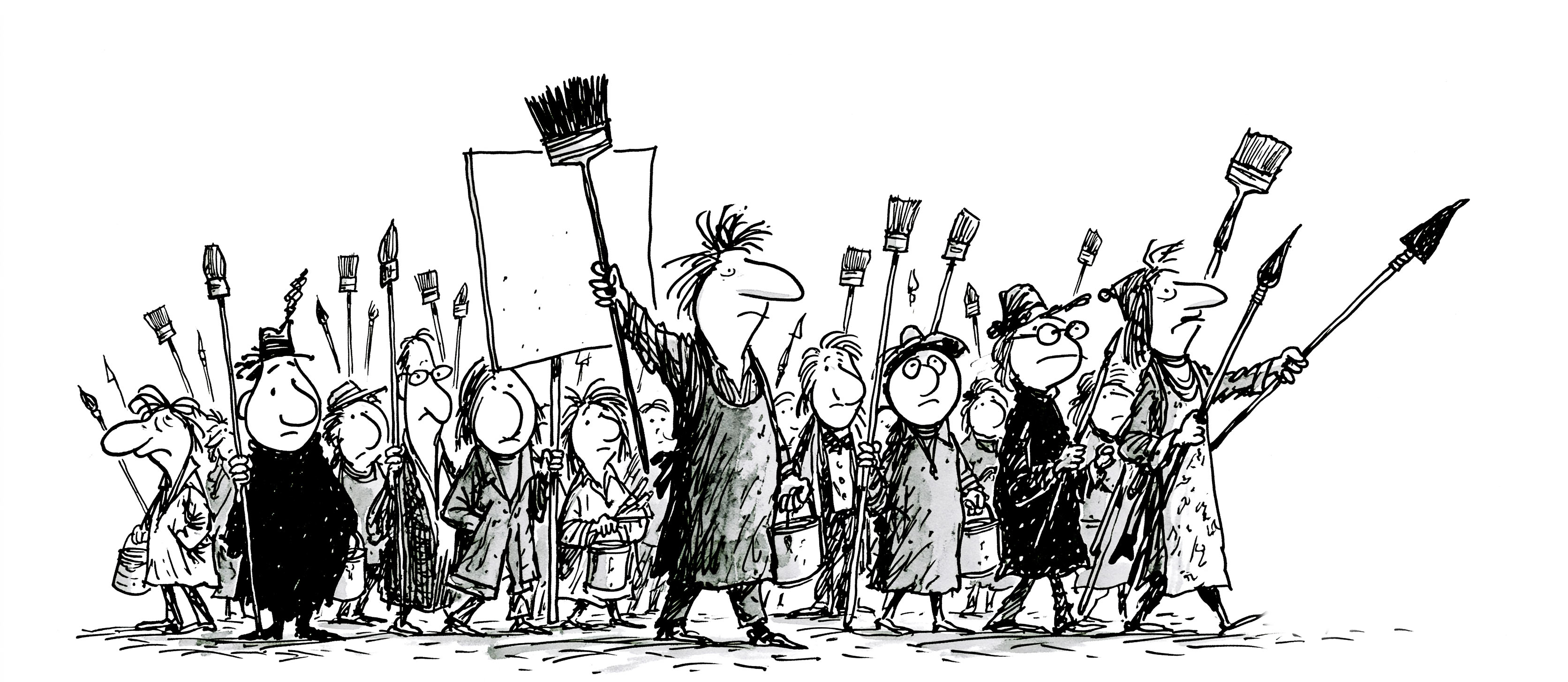
Somewhere along the way the department heads all quietly became painters, the fussy kind, and the deciding argument in the room stopped being a number or a reason. It is “I don’t like it.” Nothing answers that, and no single version pleases everyone, so the canvas goes back to the easel and the strike resumes next week.
From across the street it looks like a board convened to pick the paint for a barn that burned down yesterday. Everyone has a confident opinion on the colour. The barn is ash. The opinions keep coming.
Let Digital Rareism Wear the Crown
Here is the move. The colour question is already answered. We spent twenty years answering it, watching people drown in screaming metrics, and we froze every one of those decisions into a library so you never have to reopen the argument. Take design off the table and only the business is left to think about: what the decision-maker must know, and what would clear their path to the next move.
That library is Rare Styles, and the philosophy underneath it is Digital Rareism. The only thing that matters is the data your audience came for, and everything else is just a tool for getting out of its way. So the components do unglamorous, settled things. They surface the one number the meeting is about. They answer in a metric or a yes. They let an alert escalate in a single colour instead of nine, and they keep quiet otherwise. Quiet is the new luxury. Certainty is the new feature. We made it open source, because a good idea should be free to multiply.
You already have Bootstrap, or Material, or whatever your team standardised on three rewrites ago. Keep them. They are very good at handing you more options. Rare Styles is for when you have run out of patience for options and just need the screen to tell the truth in thirty seconds.
Stop deciding what colour the dashboard should be. Decide what your business actually needs to see.
Grab it at raredigits.art, read the manifesto if you want the full creed, and steal the examples, which work on the first try. Only the rare survives.
P.S. No promise about boosting your conversion 300%. Just common sense, in code.